Why Typeform's format works, and why Typeform itself doesn't quite fit
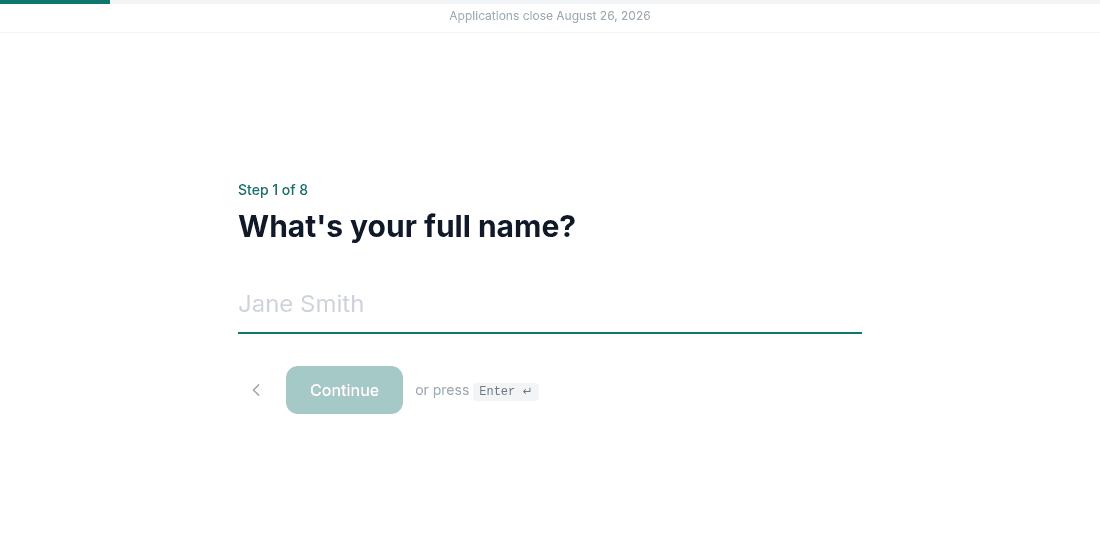
Typeform popularized the one-question-per-screen format for a good reason: it converts. Showing a single question at a time, styled cleanly and keyboard-navigable, keeps people moving instead of confronting them with a long form and an intimidating scroll bar. That format genuinely reduces abandonment, and it is the right instinct for a job application, where you want a busy candidate to actually finish.
Where it breaks down for hiring specifically: Typeform's free plan caps you at 10 responses a month, and (the part that actually matters for a job application) file uploads are not available on the free plan at all. To accept a single resume, you need the Basic plan, roughly $25/month billed annually. And once responses come in, Typeform gives you a list of submissions, not a hiring workflow: no shortlist status, no way to mark someone as rejected, nothing built for comparing candidates against each other.
What ApplyHere keeps from that format, and what it adds
- The one-question-per-screen flow. The same low-friction pattern, built specifically around the fields a job application needs: name, email, resume, screening questions.
- Resume upload with no login required. Candidates attach a file directly, with no account to create on either side.
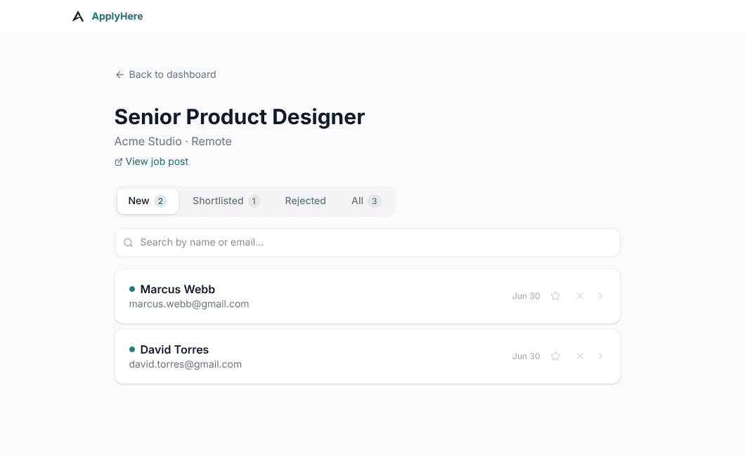
- A dashboard instead of a response list. Every applicant gets a status: New, Shortlisted, Rejected, so you are running a pipeline, not scrolling a spreadsheet of submissions.